

The Art of Color: Transform Your Home from Ordinary to Extraordinary

Choosing a Color Palette
Have you ever considered how a splash of color can transform your home from ordinary to extraordinary? Color isn't just something we see; it's something we feel. Choosing a color palette with the right shades can set the perfect mood and create an environment that's totally you. Whether you're making your home's interior a cozy retreat or giving your exterior a bold makeover, choosing colors is an adventure that shapes the character of your home.
How Important is Choosing a Color Palette?
- Sets the Mood: Colors influence emotions and can create a calming, energizing, or balanced atmosphere.
- Enhances Aesthetic Appeal: A well-chosen color palette enhances the visual appeal of your home, making it more attractive and welcoming.
- Creates Harmony: Consistent color schemes create a sense of flow and unity throughout your spaces, both inside and out.
- Reflects Personal Style: Colors can reflect your unique style and personality, making your home truly yours.
- Increases Property Value: Thoughtful color choices can boost curb appeal and potentially increase the resale value of your home.
- Improves Functionality: Different colors can affect how a space feels and functions, such as promoting relaxation in bedrooms or focus in home offices.
- Adapts to Lighting: A well-chosen palette considers how colors change under different lighting conditions, ensuring your home looks great all day.
- Compliments Architectural Features: The right colors can highlight and enhance the architectural details of your home.
- Balances with Environment: Choosing colors that harmonize with the natural surroundings creates a cohesive and pleasing exterior.
- Prevents Clashing: A thoughtful palette avoids jarring contrasts and ensures all elements of your home work together beautifully.
Setting the Tone
Think of colors as magic wands that set the tone for any space, inside and out. Soft, calming tones like pastels and muted shades can turn any room or exterior space into a peaceful retreat. Imagine a bedroom painted in gentle lavender or soft beige, where you can unwind after a long day. Or picture a home exterior in muted blue-gray, creating a serene and inviting curb appeal. These colors soothe the senses and help you relax.
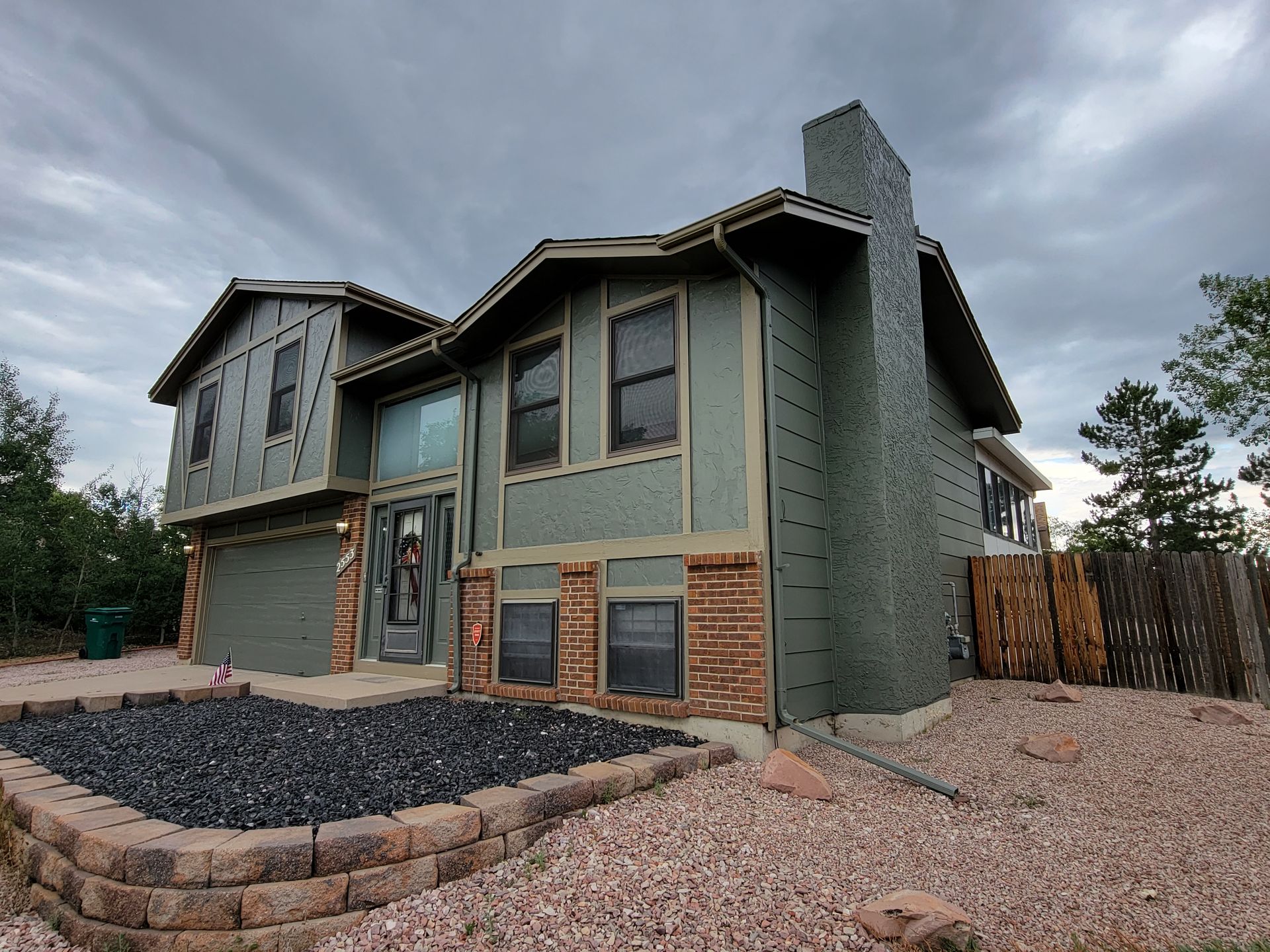
On the flip side, vibrant, energetic hues like bold reds and bright yellows can add a sense of joy and liveliness. Picture a front door painted in a striking red that welcomes guests with energy or a kitchen with splashes of bright yellow that energize your mornings. These colors can make an area come alive, infusing it with energy and warmth.
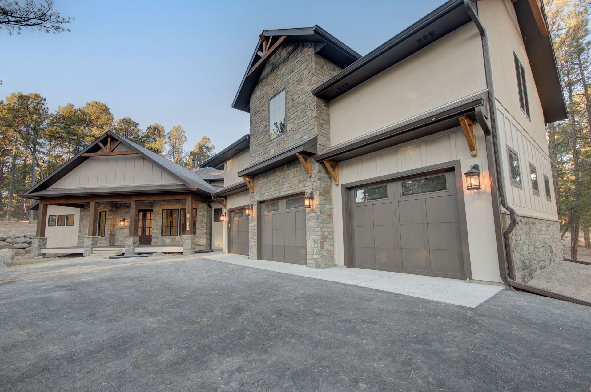
Earthy neutrals, like warm browns and soft grays, provide a grounding effect, adding warmth and stability. They create a solid foundation, making any space feel welcoming and secure. Think of a living room with earthy tones where the colors of the walls and furniture blend seamlessly with the natural elements outside or an exterior with warm taupe siding that harmonizes with the surrounding landscape. These choices create a harmonious and inviting atmosphere.
Choosing the Perfect Palette
Selecting the perfect color palette is crucial because mismatched or overly bold colors can make a space chaotic and uncomfortable. It's essential to consider both your color choices' aesthetic and emotional impact. Understanding how different colors interact and influence our emotions helps create spaces that are beautiful and inviting.
Begin by considering the purpose of each room and the feeling you want to evoke. Soft blues and greens can promote a calming atmosphere in a bedroom, where relaxation is key. Muted tones of green or blue in a home office might enhance productivity and concentration by providing focus and clarity.
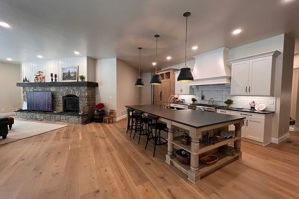
A well-coordinated color scheme makes your whole home feel connected and inviting. Imagine soft, neutral tones flowing seamlessly into complementary shades, creating visual interest without any jarring contrasts. This kind of continuity can make your home feel larger and more harmonious. Whether you're picking colors for inside or outside, choosing shades that blend beautifully with the natural surroundings and existing features is essential. Harmonious combinations enhance your home's look and feel, making every area seem thoughtfully designed. Considering your home's architectural style and the surrounding environment helps you make balanced, appealing choices that enhance the overall vibe.
Embrace the power of color and transform your environment into a reflection of your unique style and personality. Choosing a color palette with the right color choices, your space can become a vibrant, welcoming place where you love spending time and entertaining guests. Let Rebekah help you bring new life and energy to your surroundings, making them places of beauty and harmony.
Sunshine and Shadows: Perfecting Your Colors with Light
Choosing the right color palette for your home is like embarking on an exciting adventure! It's not just about picking a shade you like—it's about understanding how shadows, lighting, undertones, and existing finishes come together to create magic. These elements can dramatically influence how a color looks in different settings, and getting them right is vital to achieving a harmonious and visually stunning space.
Shadows are the secret influencers of color, subtly altering how shades appear throughout the day. They are crucial in how we perceive color, as natural light shifts and interacts with various surfaces. Understanding the impact of shadows helps you choose colors that remain beautiful and consistent regardless of the time of day.
Shadows from furniture, architectural features, and window treatments can affect how colors appear on walls in interior spaces. A vibrant, bright color in direct sunlight might seem darker and more muted in shaded corners. Recognizing this interaction allows you to select colors that enhance the room's overall feel, creating a dynamic and inviting atmosphere.
For exterior spaces, shadows cast by trees, neighboring buildings, and landscape features can influence how your home's colors are perceived. A sunny afternoon makes your exterior paint look brilliant and lively, while the same colors seem more subdued on an overcast day. Testing colors on different walls and observing them at various times can help you choose a color palette with shades that look great in all lighting conditions.
Shadows also interact with textures. Rough textures, like stucco or brick, can create more pronounced shadows and variations in color, while smoother surfaces provide a more uniform appearance. By considering how shadows and textures work together, you can select colors that enhance your home's architectural features.
Lighting and Weather Variations
Lighting is crucial in how colors are perceived inside and outside your home. The changing light conditions throughout the day and varying weather patterns can significantly alter the appearance of your chosen colors. By understanding these effects, you can make more informed decisions and ensure your colors look stunning in all conditions.
Whether indoors or outdoors, light interacts with color in dynamic ways. Bright, midday sunlight can make colors pop and appear more vivid, while softer, diffused light during the morning and evening can add warm undertones. Overcast skies can mute colors, giving them a subdued look. Given all these possibilities, observing how colors change under different lighting conditions is essential to achieve a harmonious and consistent appearance.

Lighting can work wonders inside your home or wreak havoc on your color scheme. Natural light varies throughout the day, affecting how colors appear. Morning light tends to be soft and cool, perfect for those gentle pastels. As the day progresses, the light becomes warmer, making colors look more vibrant. By evening, artificial lighting takes over, and this is where things get tricky. Incandescent bulbs cast a warm yellow glow, making colors appear richer and warmer. Fluorescent lights, on the other hand, give off a cooler, bluish hue, which can make colors look stark.
When choosing colors for your rooms, consider how much natural light each gets and what kind of artificial lighting you'll be using. A color that looks perfect in a sunlit room might seem completely different under a lamp. Balancing these lighting sources will help you create a space that feels just right at any time of day.
Now, let's step outside. The exterior of your home is a canvas constantly painted by the sun and the weather. Bright midday sunlight can make your home's colors pop, making them look vibrant and lively. However, the golden light of dawn and dusk adds warm undertones, giving colors a softer, inviting glow. Overcast skies can make colors appear muted and subdued, while clear skies can enhance their brightness.
Unique Challenges at High Altitudes
Our unique altitude in Colorado Springs adds an extra layer to how we perceive color. The higher elevation means the sunlight is more intense, making colors appear brighter and more vibrant than at lower altitudes. However, this bright sunlight can also wash out lighter colors, making them look faded.
The intense sunlight at high altitudes can be both a blessing and a challenge. While it can make colors pop and look more vivid, it can also accelerate the fading of darker shades. Therefore, choosing colors that can withstand the harsh sunlight and maintain their vibrancy over time is essential.
Testing colors in natural light at different times of the day can help you make the best choice for your home's exterior and interior.

Sample, Sample, Sample
Sampling is your best friend when it comes to choosing the perfect color. Don't just rely on paint chips or small swatches. Instead, get sample pots of your favorite colors and paint large sections on your walls inside and out. Observe how they look at different times of the day and in various weather conditions.
Try samples on various interior walls to see how shadows and light affect the color. A perfect shade on one wall might work better on another. For exteriors, paint a section that gets both direct sunlight and shade. This will give you a true sense of how the color will look throughout the day and in different weather conditions.
By taking the time to sample colors, you can avoid costly mistakes and ensure that your final choice is one you'll love in every light.
Mastering the interplay of shadows and lighting is essential for creating a harmonious and visually stunning space. How light interacts with color can dramatically influence how shades appear throughout the day, whether inside or out. Understanding these nuances and taking the time to sample colors in various conditions ensures your home looks beautiful and consistent, no matter the time of day or weather.
Choosing a Color Palette
Navigating these factors can be overwhelming, but that's where color specialists at Front Range Painters come in. With our expertise, you can make informed decisions harmonizing with your vision and lifestyle. We will guide you through the complexities of lighting and shadows, ensuring your colors look stunning and enhance the overall feel of your space. If the challenge of choosing a color palette is holding you back, let us help!


Front Range Painters, LLC